 |||
|||
Today I found a GDC talk by the UX wizard at Inkle, Joseph Humfrey. A video that I hadn’t seen before. To rectify this, I’ve decided to not just watch the video but also to take notes on it.
But first, here is the talk on Youtube:
And here is a link back to my directory of videos and notes from the people at Inkle.
The whole talk is mainly focused on two concepts Focus and Pacing:
making sure the player isn’t distracted and there isn’t anything in the way of their current task (ie reading). This isn’t about the player actively focusing, it’s about having the game be designed in such a way that they aren’t distracted and can focus effortlessly.
Less text on the screen makes reading more effortless. Here’s an example:
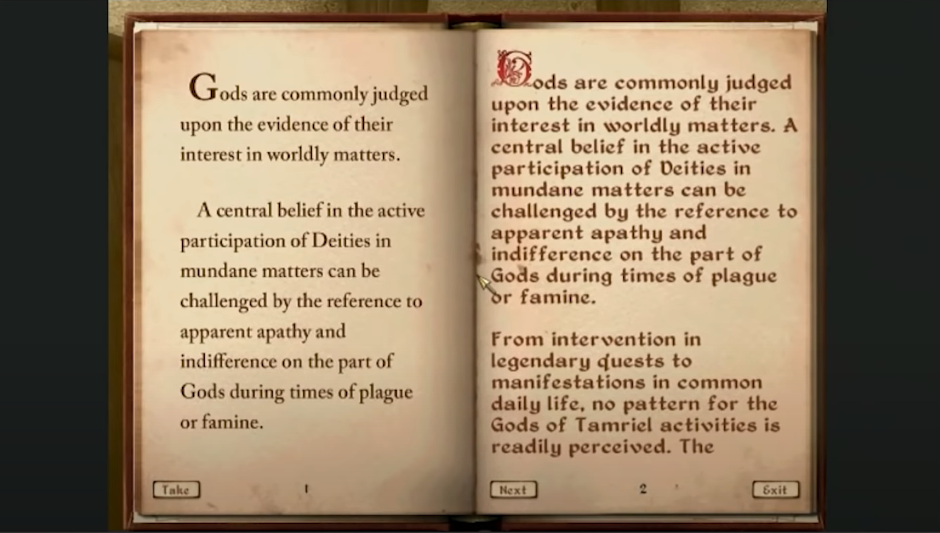
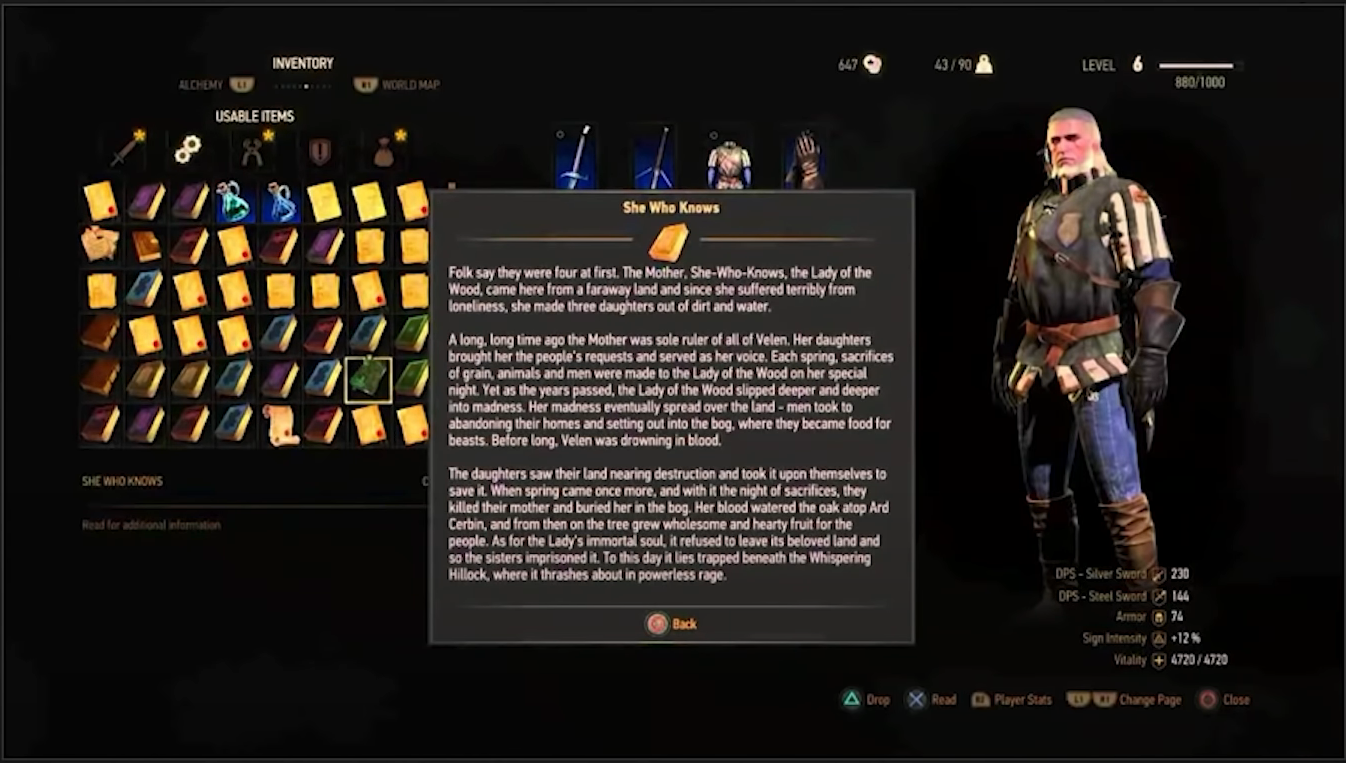 The Original: A readable book item in The Witcher
In this example, there is a massive chunk of text all on screen at the same time. The player’s eyes glaze over and they likely then hit ‘Back’.
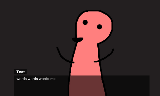
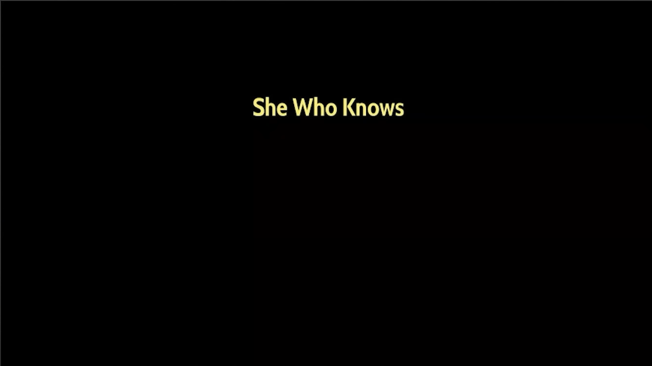 The Redesign: Part 1
First, Humfrey reduces everything down to just being about the text. Furthermore, he chooses to have just the title appear first which helps make it feel significant.
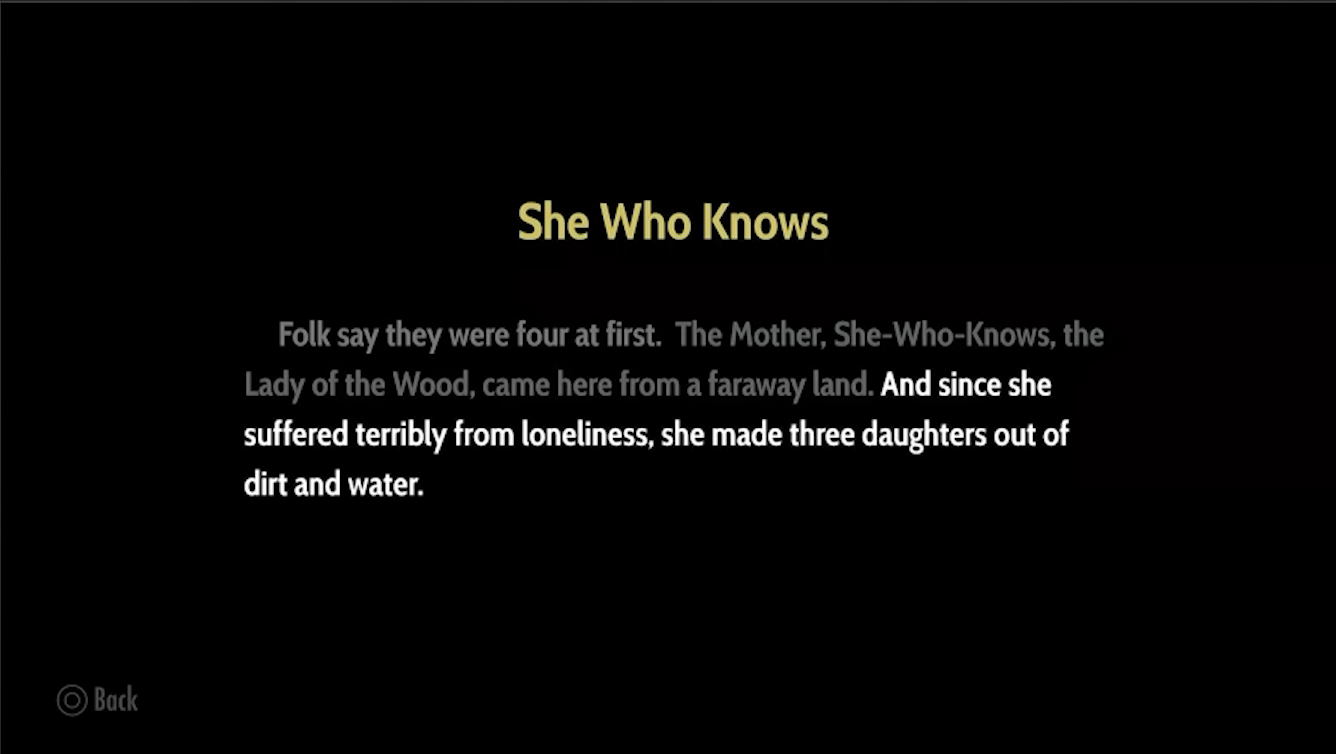 The Redesign: Part 1++
Next, each line appears one after another after the player hits ‘Next’. Each line then becomes faded as soon as it isn’t the most immediate one. He also adds a faded, subtle ‘Back’ prompt which they’ll hopefully now not use.
Humfrey’s goal when it comes to typography is to reduce friction and thus improving player focus. For typeface, readability is paramount. Legibility (can each letter be distinguished?) vs Readability (do you want to claw your own face off after reading 50k words)
Often readability is more a matter of ‘how familiar are your eyes with these shapes’, so a font that’s closer to a font used commonly today will have higher readability among modern audiences.
Another example (using a book from Morrowind):
 < Left: edited version | Right: Original >
Changes:
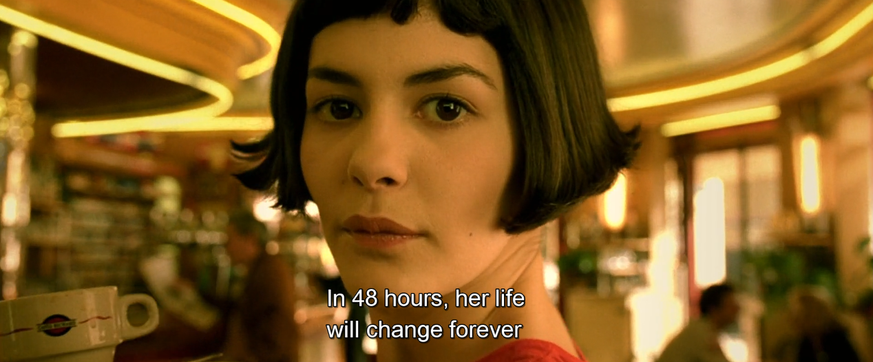 just an example screenshot from Amelie with subtitles
Ever had the problem where you’re watching a film but you’re so focused on reading the subtitles that you’re missing what’s happening? In games it can be similar so it can be a good idea to put the text nearish to where the action is happening.
This actually reminds me of Mad Max Fury Road and how the way the editor was able to have such quick cuts work was by having all the action take part in the same area of the screen no matter the shot.
Brightness and colour: this can be used to draw the player’s eye to what’s important right now at this moment. The previous lines can be faded but still visible for context.
By showing text a little bit at a time, it gives players time to settle into ‘sitting down to do a bit of reading’ mode. In a sort of tongue and cheek way, this makes me think of finite state machines in programming where the entity can only be in one state at a time and needs proper transitions between them.
Things that affect pacing include: the amount of text that appears at a given time, the way it appears (such as animations), as well as the visual structure of the text (such as line length or where paragraphs occur).
In the end, it’s a matter of balance.
Smaller sections of text -> Slow the Pace Down
Larger sections of text -> Speed the Pace Up
Because of how fiddly it all is, pacing is very difficult which in turn calls for constant testing, iteration, and testing again. Writing and developing the UI are things that should go hand-in-hand. In addition, different platforms have different flows which perhaps should be accounted for with even more testing. Testing!
So far, the things Humfrey has talked about are for pacing in the short term, such as a dialogue sequence within a larger game. However, one must also consider more long term pacing of a game, especially if it’s a text heavy one.
As time passes between natural stopping points, the tension increases. Natural stopping points or milestones are things like chapter breaks in a book. Another example of a way to alleviate fatigue is to show progress as in a progress bar or page count when reading an e-book.
So, what tools are there to control pacing and deal with player fatigue?
For one, there’s providing a variety of content, not just reading text. This can break up the flow of things, give a sense of contrast, as well as make previously boring activities feel fresh again.
Also, if you give players control over when these shifts in gameplay occur, such as selecting to enter a battle or move to the next stage, it can increase their sense of ownership over what’s happening.
Finally, content of different types can be used as a reward. This point reminded me of finally hitting a cutscene after a tough battle in Final Fantasy XIV and how rewarding it felt to get to sit back and watch the story unfold.
Another way of trying to deal with fatigue during longer sections is to create a sense of progress. Just be mindful that sometimes knowing that they’re nearly done makes the player rush toward the end and skim too quickly over things.
The last section of Humfrey’s talk goes into animation. Since animations are used so often to convey things to the player, having nice ones often conveys a feeling of quality and can help draw the player in before they’re properly invested. I personally think Nintendo games are especially good in this area. Just poking about the menus of a Nintendo DS feels good and meaty.
Animation can also be functional as they can be used to draw the player’s eye to an area of import where, perhaps, the next bit of interaction will be or next piece of text will appear.
Something to be mindful of is to avoid slowing fast readers down. Of course, neither should you make things too fast for slower readers, especially if the main text moves forward automatically. Be sure to keep testing with different people to get the text appearance speed to a good place.
But, going back to contrast, it can be useful to slow down the appearance of things such as in 80 Days where choices fade in more slowly as compared to the main text. This is done to point the players into considering their choices more and to not distract from the main text if they’re still reading it when the choice appears. The slowness, or rather the contrast, is used to emphasise things.
As a final point, Humfrey says that you know your UX is working when you go to test your game and end up just playing and reading and forgetting what you were there to do in the first place. I think this will be a useful barometer to help me gauge the quality of my work going forward.
Final, final point, Humfrey links to Inkle’s opensource Unity component SLayout that can be used to animate UI and such in Unity. I haven’t tried it myself yet, but I certainly want to in the future.
That I think will serve me well in making my visual novel:
All in all, this actually reminded me a lot of when I worked in comics or when I was studying animation. In those fields, you are constantly focused on leading the reader or viewer through the work and thinking about what kind of impression things are having. Having appropriate pacing is obvious for animation, but it’s equally as important in comics. Using multiple panels to convey the same moment slows down the action while also making it feel more significant, and skipping sections of time between panels makes things feel a lot faster.